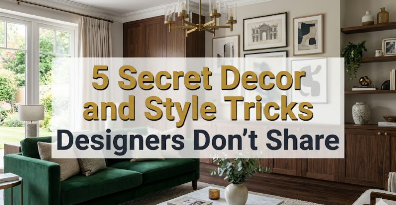
5 secret decor and style tricks designers don’t share
There’s a quiet moment that happens in a beautifully designed room—a moment you can’t quite explain. You step in, pause, and something feels right. Not loud. Not staged. Just right. Designers are often praised for their taste, but what really separates their work from the rest isn’t just taste—it’s a set of subtle, almost invisible decisions layered carefully over time.
These aren’t the things you see shouted across social media. They’re not always tied to expensive furniture or trending color palettes. In fact, many of these “secrets” are rooted in restraint, perception, and psychology rather than budget.
This article isn’t just a list of tips. It’s a walk through the thinking behind five under-the-radar decor and style tricks—approaches that quietly elevate a space without making it feel forced. You’ll notice patterns, small experiments, and even a few exercises you can try in your own home as you read.
Let’s begin where most people think design starts—but actually doesn’t.
- the illusion of intentional imperfection
Walk into a showroom, and everything is aligned to perfection. Pillows sit upright. Books are stacked with mathematical precision. It looks good—but it rarely feels like a home.
Designers know this. And they quietly undo perfection.
The trick isn’t to make things messy—it’s to make them human.
Imagine a coffee table styled with three objects: a book, a candle, and a small sculpture. A beginner might center everything. A designer might offset the book slightly, tilt the candle a few degrees, and let the sculpture sit just off balance. Not enough to feel chaotic—but enough to feel lived-in.
Try this small exercise:
Take a perfectly arranged surface in your home. Now:
- Slide one object slightly off-center
- Rotate another by a few degrees
- Remove one item entirely
Step back.
Notice how the space breathes differently.
This is what designers rarely explain: perfection creates distance. Imperfection invites presence.
They also use asymmetry intentionally. A gallery wall that looks random often has invisible anchors—a slightly larger frame, a darker piece, or a horizontal line tying it together. It feels spontaneous, but it’s carefully disrupted balance.
The secret isn’t “make it imperfect.” It’s “make it look like it evolved.”
- layering time, not just textures
You’ve probably heard about layering textures—linen, wood, metal, glass. That’s surface-level advice.
What designers actually layer is time.
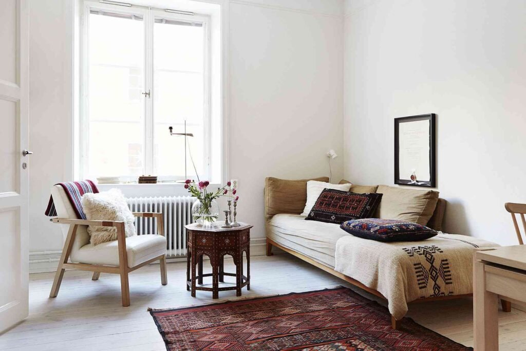
A room that feels rich often contains objects that don’t belong to the same moment. A modern sofa might sit beside a slightly worn wooden side table. A new rug might hold a vintage pattern. A sleek lamp might rest next to a stack of old books.
This creates a narrative.
Without it, a space can feel like it was purchased in a single afternoon—which, ironically, makes it feel flat.
Here’s a simple way to apply this idea:
Pick one corner of your room and ask:
- What here looks new?
- What here looks aged?
- What here looks personal?
If everything answers the same way, the space lacks depth.
You don’t need antiques to fix this. Even small shifts help:
- A slightly distressed tray
- A handmade ceramic piece
- A framed print that isn’t perfectly aligned
Designers often introduce “time contrast” deliberately. It makes a space feel like it has a past—even if it was decorated last week.
And people respond to that without realizing why.
- controlling sightlines instead of filling space
Most people decorate by filling empty areas. Designers, on the other hand, think about what your eye does when it enters a room.
They control sightlines.
Stand at the entrance of your room right now. Don’t move. Just observe:
- Where does your eye go first?
- Where does it go next?
- Where does it stop?
If your eye jumps around without settling, the room feels restless.
Designers guide this movement subtly. They might place a slightly taller object at the end of a line of sight. Or use contrast—a darker piece against a light wall—to create a visual anchor.
One quiet trick: create a “pause point.”
This is a spot where the eye naturally rests. It could be:
- A statement chair
- A framed artwork
- A plant with height and shape
Everything else supports that point.
Try this:
Clear one wall or surface almost completely. Then place a single, intentional object there. Step back.
You’ll notice something surprising—the room often feels more complete, not less.
Designers don’t rush to fill emptiness. They shape it.
- the quiet power of scale distortion
Scale is one of the least discussed—and most powerful—tools in design.
Most people play it safe: medium-sized furniture, medium-sized decor, medium-sized art.
Designers break that pattern.
They either go slightly larger or slightly smaller than expected.
A large mirror in a small room doesn’t just reflect light—it shifts perception. A tiny object on a large table can feel more intentional than several medium ones scattered around.
Here’s a simple rule designers follow quietly:
Avoid “almost right” sizes.
If a rug is just a bit too small, the room feels disconnected. If art is slightly undersized, it looks like an afterthought.
Instead:
- Go bigger than feels comfortable (but still proportional)
- Or go intentionally minimal
Try this experiment:
Place a very small object in a large empty space—like a single vase on a wide table. Let it stand alone.
Then try the opposite—group several items tightly in one area, leaving the rest empty.
Notice how both feel more deliberate than spreading everything evenly.
Designers use scale to create tension—and tension creates interest.
- using shadow as a design element
Most people think about light. Designers think about shadow.
Light reveals. Shadow defines.
A room with even, flat lighting often feels dull, no matter how well it’s decorated. But introduce layers of light—and suddenly shadows appear. These shadows add depth, contrast, and mood.
Designers rarely rely on a single overhead light. Instead, they combine:
- Ambient light (general illumination)
- Task light (focused, functional)
- Accent light (decorative, atmospheric)
But the real trick is placement.
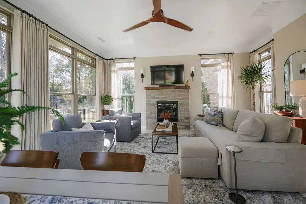
A lamp placed slightly behind an object creates a soft halo. A wall light angled downward creates texture. A plant near a light source casts organic shadows that move throughout the day.
Try this tonight:
Turn off your main light. Use only a lamp or two.
Walk around the room.
Notice what appears—and what disappears.
You’ll see corners you’ve ignored, textures you hadn’t noticed, and shapes that feel new.
Designers use shadow to tell a quieter story—one that changes depending on time, angle, and mood.
bringing it all together
These five tricks aren’t about rules—they’re about awareness.
Designers don’t necessarily have better furniture or bigger budgets. What they have is a trained sensitivity to:
- balance that isn’t obvious
- contrast that isn’t loud
- decisions that don’t scream for attention
If there’s one thread connecting all these ideas, it’s this: restraint creates impact.
You don’t need to redesign your entire home. Start small.
Pick one surface. One corner. One wall.
Apply just one idea:
- introduce slight imperfection
- mix something old with something new
- create a visual pause
- adjust scale
- play with light and shadow
Then leave it alone for a day.
Come back later and notice how it feels—not just how it looks.
Because in the end, great design isn’t about impressing people. It’s about creating a space that quietly supports the way you live.
And that’s the part designers rarely put into words.
—
frequently asked questions
- do these tricks work in small spaces or only large homes?
They often work even better in small spaces. Subtle changes like adjusting scale, controlling sightlines, and using layered lighting can make compact areas feel more intentional and spacious without adding clutter.
- do i need expensive items to achieve this kind of look?
Not at all. These tricks rely more on placement, proportion, and contrast than cost. Rearranging what you already own can create a noticeable difference without buying anything new.
- how do i know if i’ve overdone it?
If everything in the room is trying to stand out, it’s too much. A well-balanced space usually has one or two focal points, with everything else supporting them quietly.
- how often should i update or change my decor?
There’s no fixed rule. Small seasonal adjustments or occasional rearranging can keep a space feeling fresh without constant changes. Designers often tweak rather than replace.
- what’s the easiest trick to start with for beginners?
Start with controlling sightlines. Declutter one area and create a clear focal point. It’s simple, immediate, and has a strong visual impact.
- can these ideas work with any design style?
Yes. Whether your style is modern, traditional, minimalist, or eclectic, these principles adapt easily. They’re less about style and more about how a space is experienced.