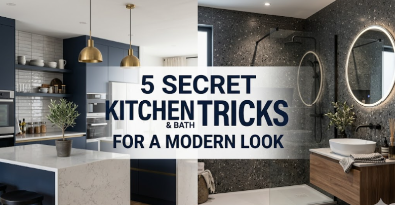
5 Secret Kitchen and Bath Tricks for a Modern Look
Walk into a truly modern kitchen or bathroom and the first thing you notice usually isn’t the marble, the fixtures, or the color palette. It’s the feeling. The room feels calm. Clean. Effortless. There’s a quiet confidence in the way everything fits together, even when you can’t immediately tell why it works so well.
That’s the real secret behind a modern look. It’s rarely about spending more. It’s about knowing where to simplify, where to hide visual clutter, and where to add one thoughtful detail that quietly changes the entire room.
Most people think modern design is built on expensive materials and dramatic renovations. In reality, the most convincing modern spaces often rely on a handful of practical design decisions that make ordinary kitchens and bathrooms feel sharper, lighter, and more intentional.
These aren’t the obvious upgrades everyone talks about. You already know about white paint, subway tile, and brushed nickel hardware. The real difference comes from the subtle choices most people overlook—the ones designers use to make a room feel current without making it feel cold.
If your kitchen or bath feels dated, cluttered, or just slightly off, the fix may not be a full remodel. It may be one of these quieter moves.
Below are five underrated kitchen and bath tricks that can instantly create a more modern look, without pushing your space into something sterile or trend-chasing.
1. Hide the visual noise first
One of the fastest ways to make a kitchen or bathroom look dated is visual clutter.
Not necessarily mess—just too many things competing for attention.
A toothbrush on the counter. A soap bottle with a loud label. Paper towels in plain sight. Knife blocks. Sponge trays. Mismatched jars. Outlet adapters. Cleaning sprays. Small appliances that never leave the backsplash. None of these items are dramatic on their own, but together they create visual static.
Modern spaces feel modern because they edit aggressively.
That doesn’t mean empty counters and unrealistic perfection. It means reducing what your eye has to process.
This is one of the least glamorous tricks in design, but it’s one of the most effective: remove the small interruptions first.
In kitchens, that often means:
- Moving oils and spices off the counter
- Storing the toaster when it’s not in use
- Replacing bulky utensil crocks with drawer inserts
- Swapping paper towel stands for under-cabinet holders
- Consolidating soaps and sprays under the sink
- Choosing one attractive tray instead of six loose countertop items
In bathrooms, it usually means:
- Decanting soap into a simple dispenser
- Hiding toothbrushes in drawers or covered holders
- Removing extra product bottles from the vanity
- Using drawer organizers instead of countertop bins
- Replacing bright packaging with neutral containers
- Keeping only one or two daily essentials visible
This works because modern design is less about what you add and more about what you stop displaying.
The cleaner the surfaces look, the more expensive the room feels.
And importantly, clean does not mean empty. It means edited.
A modern room lets the architecture speak before the accessories do.
Quick reset checklist
Before buying anything, remove:
- 30% of what sits on your counters
- all duplicate visible products
- anything with bright packaging
- anything you don’t use every day
Then step back and look again.
Most rooms start looking more modern in under twenty minutes.
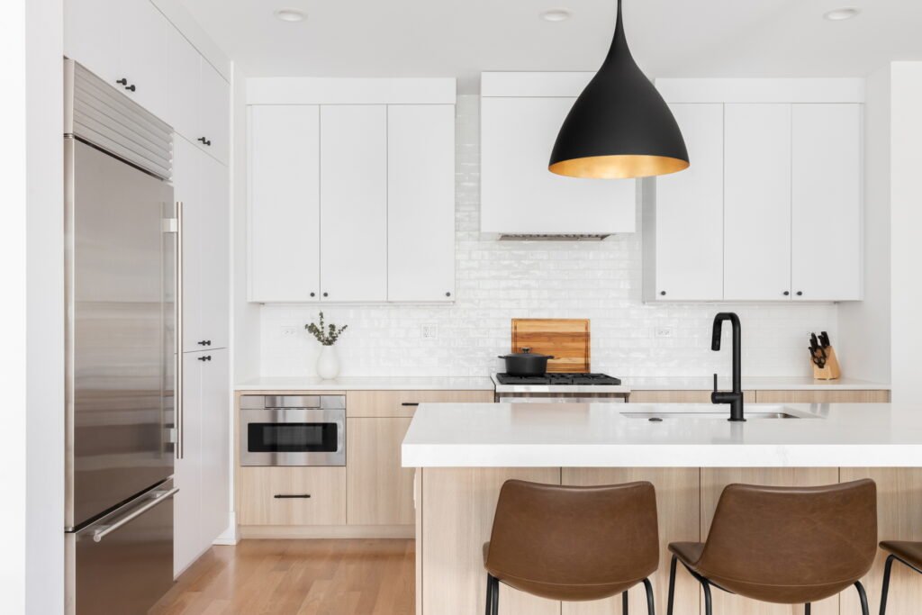
2. Use shadow lines instead of decorative contrast
A lot of older kitchens and bathrooms rely on contrast to create detail.
Dark grout with white tile. Heavy cabinet trim. Ornate molding. Thick hardware. Decorative toe kicks. Framed mirrors. Raised-panel doors.
Older design tends to announce every edge.
Modern design does the opposite. It lets edges recede.
That’s where shadow lines come in.
A shadow line is the small, deliberate gap or recess that creates depth without visual heaviness. Instead of using trim, ornament, or contrast to define shapes, modern spaces use subtle shadows.
It’s one of the quietest upgrades you can make, and one of the most powerful.
Examples include:
- Flat cabinet fronts with a slight reveal
- Floating vanities with space beneath
- Recessed medicine cabinets
- Slab backsplash transitions
- Minimal toe kicks set slightly inward
- Thin gaps between millwork and wall edges
- Under-cabinet lighting that creates soft dimension
- Integrated handles or finger pulls instead of protruding hardware
These details matter because modern design depends on restraint.
Instead of drawing attention with decoration, it creates depth with precision.
That’s why a floating vanity often looks more current than a traditional one, even when both use the same finish. The floating version creates a clean shadow beneath it. That shadow makes the room feel lighter, sharper, and more architectural.
The same principle applies in kitchens. Cabinets that run flat and uninterrupted feel more modern than cabinets broken up by ornate trim and decorative panels.
The eye reads consistency as sophistication.
Where to use shadow lines immediately
You don’t need custom millwork to use this.
Start here:
- install under-cabinet lighting
- swap raised cabinet fronts for flat profiles when possible
- choose a floating shelf instead of thick decorative shelving
- recess storage rather than layering it outward
- use slimmer mirror frames or none at all
- avoid chunky trim where a clean edge will work
The goal is simple: let depth come from shadow, not decoration.
That’s what makes a room feel current.
3. Match undertones, not colors
This is one of the biggest reasons kitchens and bathrooms feel unintentionally outdated, even after expensive upgrades.
Most people match colors.
Designers match undertones.
And that difference changes everything.
You can have white cabinets, white tile, white walls, and white counters in the same room—and still have the space feel wrong.
Why?
Because whites are not just white.
Some lean warm.
Some lean cool.
Some lean gray.
Some lean cream.
Some lean green.
Some lean pink.
When undertones clash, the room feels off even if everything technically “matches.”
This is one of the most common reasons renovated kitchens still look awkward:
- warm beige floor
- cool white cabinets
- creamy quartz
- stark white sink
- gray backsplash
Nothing is individually bad. Together, they fight.
Modern spaces feel cohesive because their undertones are aligned.
That doesn’t mean everything is identical. It means everything belongs in the same temperature family.
A warm modern kitchen might include:
- soft ivory walls
- natural oak
- warm white cabinets
- creamy stone
- muted brass
- greige flooring
A cool modern bath might include:
- crisp white walls
- pale gray porcelain
- charcoal accents
- polished chrome
- soft blue-gray vanity
- clean white quartz
Both can look modern. But mixing the two carelessly usually creates tension.
The easiest way to test undertones
Take a plain sheet of white printer paper and hold it next to your surfaces:
- cabinet
- tile
- countertop
- tub
- sink
- paint sample
That quick comparison reveals whether something pulls yellow, blue, pink, green, or gray.
Do this before buying anything new.
It’s one of the simplest ways to avoid a room that feels unintentionally disjointed.
Modern design doesn’t require fewer materials.
It requires materials that speak the same language.
4. Treat lighting like architecture, not decoration
Lighting is where many kitchens and bathrooms lose their modern edge.
People often think of lighting as the jewelry of the room—pendants, sconces, statement fixtures.
And yes, decorative fixtures matter.
But modern spaces use light more structurally than decoratively.
They treat light as part of the architecture.
That means the most important lighting in the room is often the least visible.
In a modern kitchen or bath, good lighting usually comes from layers:
- ambient light for general illumination
- task light for work zones
- accent light for depth
- decorative light for personality
Most dated rooms rely too heavily on one source—usually a central ceiling fixture.
That creates flat light.
Flat light makes even expensive finishes look ordinary.
Layered light creates dimension.
And dimension reads modern.
In kitchens, that usually means:
- recessed ceiling lighting instead of one central fixture
- under-cabinet task lighting
- toe-kick lighting for subtle glow
- pendants used selectively, not excessively
- dimmers on everything possible
In bathrooms:
- vertical vanity lighting instead of harsh overhead-only light
- backlit mirrors
- recessed shower lighting
- dimmable ambient light
- subtle niche lighting in larger showers
This matters because modern rooms are designed to shift mood.
Bright when functional.
Soft when quiet.
Dim when relaxed.
A room that can change tone instantly feels more sophisticated.
The biggest mistake people make is overusing decorative fixtures and underusing invisible light.
A beautiful pendant helps.
But a hidden LED strip under a floating vanity often does more to make the room feel modern.
Simple lighting upgrades with big payoff
- add warm under-cabinet LEDs
- install dimmers
- replace overhead vanity bulbs with side lighting
- use one statement fixture, not three
- light edges and recesses, not just the center of the room
Good modern lighting should feel natural, not theatrical.
You should notice the room first and the fixture second.
5. Make one material feel continuous
Modern spaces often feel luxurious for one subtle reason: fewer visual interruptions.
One of the easiest ways to create that feeling is to let one material run farther than expected.
Continuity is one of the strongest signals of modern design.
Instead of breaking every surface with transitions, trims, and contrast points, modern spaces stretch materials to create calm.
This can be done in simple ways:
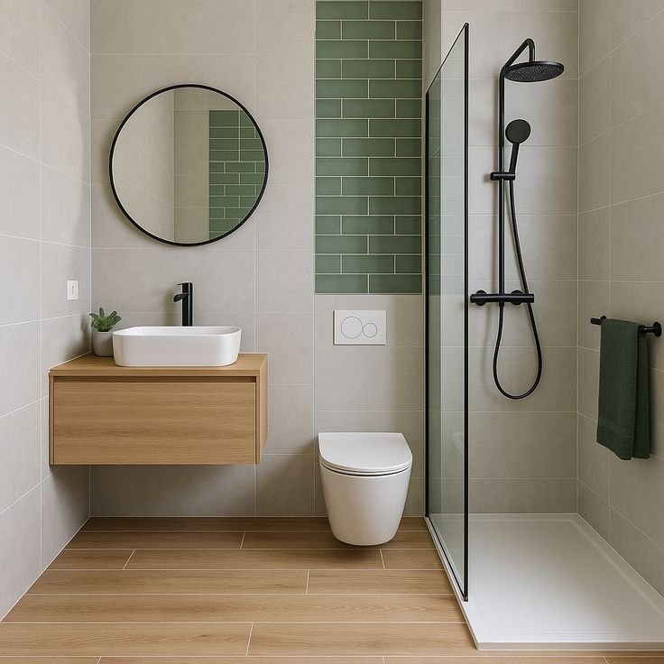
- countertop material continues up the backsplash
- shower tile runs wall to wall
- vanity stone wraps the side panel
- floor tile continues into the shower
- cabinet finish repeats in adjacent storage
- wall paint extends across trim for a seamless look
This creates visual flow.
And flow feels expensive.
Traditional spaces often separate everything:
counter, then backsplash, then trim, then accent strip, then wall color change.
Modern spaces reduce those stops.
The fewer times the eye has to pause, the cleaner the room feels.
This doesn’t mean every room should be monotone or minimal to the point of boredom. It means choosing one material and allowing it to carry more visual weight.
That one move often does more than adding five “upgrades.”
A quartz slab backsplash usually looks more modern than decorative tile mosaics.
A full-height shower tile wall often feels cleaner than multiple accent bands.
A continuous floor reads larger than one broken by thresholds and transitions.
The effect is subtle but immediate.
The room feels calmer because the eye travels farther without interruption.
Where continuity matters most
Focus on the largest visual planes:
- backsplash
- shower walls
- vanity surround
- flooring
- cabinet runs
Choose one surface and simplify it.
That single decision can modernize the whole room.
The modern look is really about control
What makes a kitchen or bathroom feel modern is rarely one dramatic feature.
It’s control.
Control of clutter.
Control of contrast.
Control of light.
Control of tone.
Control of where the eye lands and where it gets to rest.
That’s what separates modern from merely updated.
A room can have brand-new finishes and still feel visually noisy.
It can have expensive fixtures and still feel dated.
It can have beautiful materials and still feel disjointed.
Modern design isn’t just newer materials.
It’s better editing.
It’s knowing what to hide, what to repeat, what to soften, and what to leave alone.
And in kitchens and bathrooms especially, those quieter choices matter more than the obvious ones.
Because the most modern rooms rarely shout.
They simply feel resolved.
Practical modern upgrades you can do without a full remodel
If a full renovation isn’t on the table, you can still use these same principles in smaller ways.
Try this short list:
- clear the counters and edit visible items
- switch to matching dispensers and containers
- replace one bulky light fixture
- add dimmers
- install under-cabinet lighting
- repaint walls to align undertones
- swap ornate hardware for cleaner pulls
- use one tray to group essentials
- remove decorative clutter
- simplify transitions and visible layers
These are not flashy changes.
That’s exactly why they work.
Modern style is built in the decisions most people barely notice—but always feel.
Common mistakes that make kitchens and baths look less modern
Even well-intentioned updates can work against a modern look.
The most common mistakes include:
- too many finishes in one room
- mixed metal tones without intention
- visible countertop clutter
- overly decorative tile accents
- harsh overhead lighting
- bulky trim
- mismatched whites
- ornate cabinet profiles
- too many small accessories
- breaking every surface with contrast
None of these automatically ruin a space.
But together, they create visual friction.
Modern rooms work because they reduce friction.
That’s the real goal.
Not trendy.
Not sterile.
Not expensive-looking for the sake of it.
Just clear, cohesive, and calm.
Final thought
The best modern kitchens and bathrooms don’t always look dramatic in photos.
In person, though, they feel different immediately.
They feel easier to be in.
That’s the detail most people miss.
A modern room is not just about appearance. It’s about visual ease.
Less tension.
Less noise.
Less interruption.
More clarity.
More continuity.
More intention.
And most of that comes from a few quiet choices hiding in plain sight.
The good news is that those choices are usually easier—and less expensive—than people think.
FAQs
1. What is the fastest way to make a kitchen look more modern?
The fastest way is to remove visual clutter. Clear counters, hide small appliances, consolidate daily items, and replace loud packaging with simple containers. This creates an immediate cleaner and more modern look without renovation.
2. Do modern kitchens and bathrooms have to be all white?
No. Modern spaces do not need to be all white. What matters more is consistency in undertones and a controlled palette. Warm neutrals, natural wood, soft gray, charcoal, and muted earth tones can all look modern when used cohesively.
3. What makes a bathroom look outdated the fastest?
The most common culprits are harsh overhead lighting, too many visible products, ornate mirrors, bulky vanities, decorative tile borders, and mismatched finishes. These details add visual noise and make the room feel older.
4. Is brushed nickel still modern?
Yes. Brushed nickel can still look modern, especially in bathrooms. The key is using it consistently and pairing it with clean lines, simple forms, and coordinated undertones. Finish matters less than how well it fits the overall design.
5. What is the biggest mistake people make when updating a kitchen?
One of the biggest mistakes is choosing finishes individually instead of considering how they work together. Cabinets, counters, flooring, tile, and paint may all look good on their own but still clash when undertones are not aligned.
6. Can a small bathroom still look modern?
Absolutely. In fact, small bathrooms often benefit the most from modern design principles. Clean lines, fewer visual breaks, better lighting, floating elements, and simplified materials can make a small bathroom feel more spacious and current.